02 · Colour and type
Colours taken from the leather.
The starting values were read from the product photographs: the cognac of the tan, the plum-tinged wine of the bordeaux, the cream of the stone and the gold of the pressing. They can be refined once the leather samples are in hand.
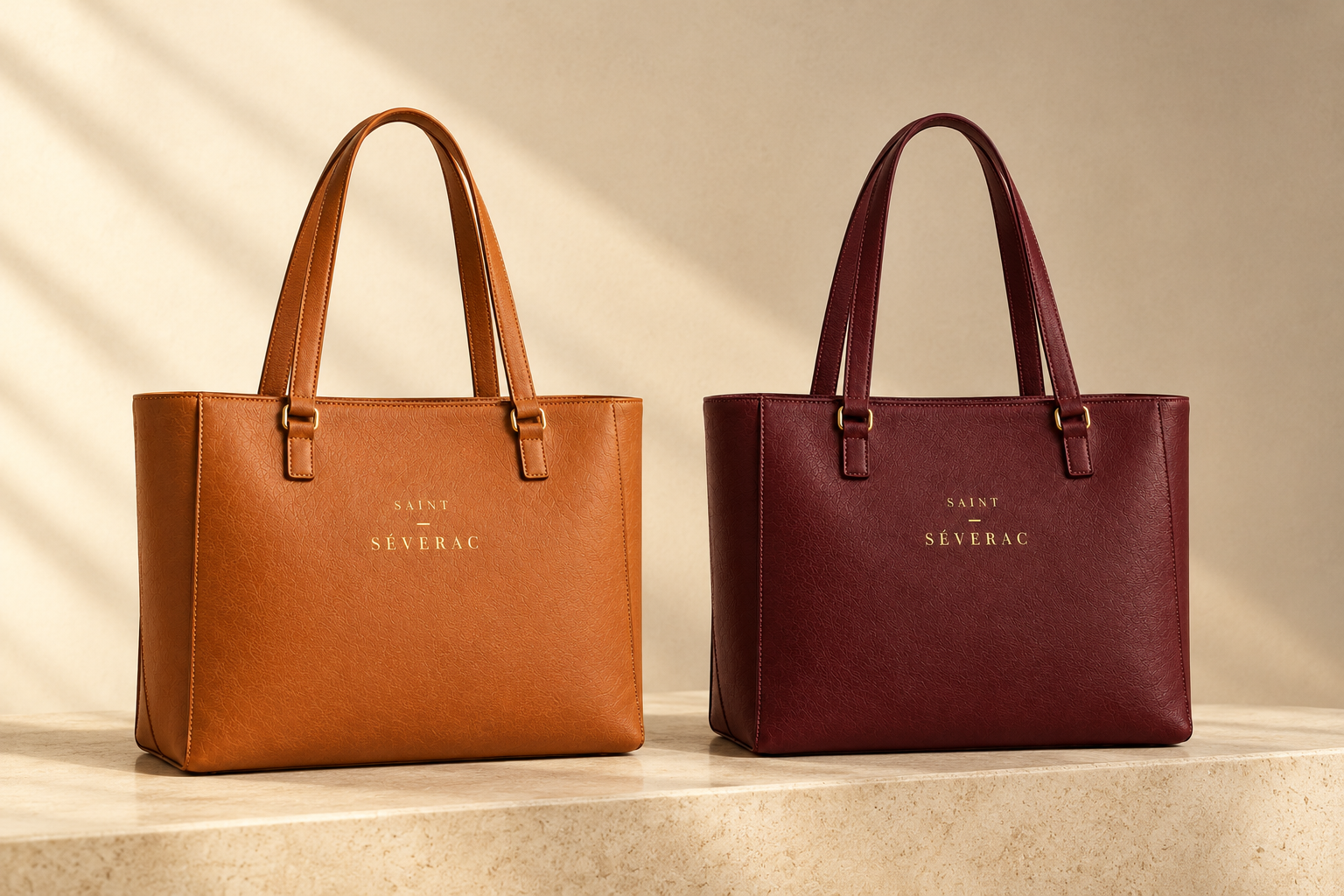
Tan and Bordeaux, side by side on stone.
The palette
Three colours from the bags, three to hold them.
Tan
#B8601F
The warm accent. A cognac brown for large type, fine fills and the bags themselves. Never for small text.
Bordeaux
#561B24
The rich, deep colour: a wine red with a hint of plum. Bands, grounds and headlines on light pages.
Cream
#EBE1D5
The calm base. Backgrounds, cards and quiet panels, and the stone behind the bags.
Ivory
#F6F0E6
The lighter base. The page itself, and the light side of cream.
Espresso
#2A1B17
All text, and the deep dark ground. Secondary text softens to #5C4A43.
Gold on dark
#C9A45C
The wordmark and fine lines, on dark and mid-tone grounds only.
Gold on cream
#9A7424
The deeper gold for the wordmark and fine lines on cream. Never for small text.
Pairings
Cream is the calm. Bordeaux is the depth. Tan is the warmth.
Gold is kept for the wordmark and fine lines only. As a guide to proportion across a page, not a rule to measure:
Ivory and cream, over half
Bordeaux, about a fifth
Tan, a touch
Espresso for text
Gold, a thread
Calm and considered.
Cream as the calm base, espresso for the words, bordeaux for the one line that matters.
Cream, espresso, bordeaux
Held with care.
Bordeaux as the rich, deep ground, ivory for the words, and a single gold line.
Bordeaux, ivory, gold line
yours
Tan as the warm accent: one large word, never a block of small text.
Ivory, espresso, tan accent
Gold only for the wordmark and fine lines.
Espresso, cream, gold
Tan carries large type, lines and the bags. It does not carry small text on cream or ivory, where the contrast is too low to read comfortably.
Tan and bordeaux meet through cream, as the bags do in the photographs.
All reading text is espresso on cream or ivory, or ivory on bordeaux and espresso.
Typography
One serif to speak, one sans to explain.
Headings and the wordmark
Aa
Cormorant Garamond
Medium 500 for headings and the wordmark. Italic for a quiet emphasis.
ABCDEFGHIJKLMNOPQRSTUVWXYZ
abcdefghijklmnopqrstuvwxyz
0123456789 É é è ç
Body text and small labels
Aa
Jost
Regular 400 for body text. Medium 500 for small labels, so they stay firm.
ABCDEFGHIJKLMNOPQRSTUVWXYZ
abcdefghijklmnopqrstuvwxyz
0123456789 É é è ç
The type scale
Sizes shown at desktop width; they step down smoothly on a phone. Small text is always heavier and darker: Jost Medium in espresso or soft espresso, never gold, never tan.
Display
Cormorant Garamond Medium
72 / 76 px
For all that she is.
Heading 1
Cormorant Garamond Medium
56 / 60 px
A calm place to begin
Heading 2
Cormorant Garamond Medium
40 / 44 px
Made in France
Heading 3
Cormorant Garamond Medium
28 / 32 px
The everyday shoulder bag
Lead
Jost Regular
20 / 32 px
Made for the day, and for everything after it.
Body
Jost Regular
17 / 28 px
A bag that carries her working day, and whatever else the day brings. Full-grain leather, handcrafted in France.
Small
Jost Medium
14 / 22 px
Genuine leather, in Tan and Bordeaux.
Label
Jost Medium, capitals
12 px, tracking +22%
Brand kit · Concept pitch
Next
Voice and imagery →