01 · The wordmark
Three lines, set in gold.
The wordmark is the one place gold speaks in full voice. It is always centred, always in three lines, and the acute accent on the first E is part of the name and is never dropped.
SAINT in small, widely spaced capitals.
A short, thin dash.
SÉVERAC larger, thin, widely spaced capitals, with the acute accent on the first E.
Typeface: Cormorant Garamond, Medium weight.
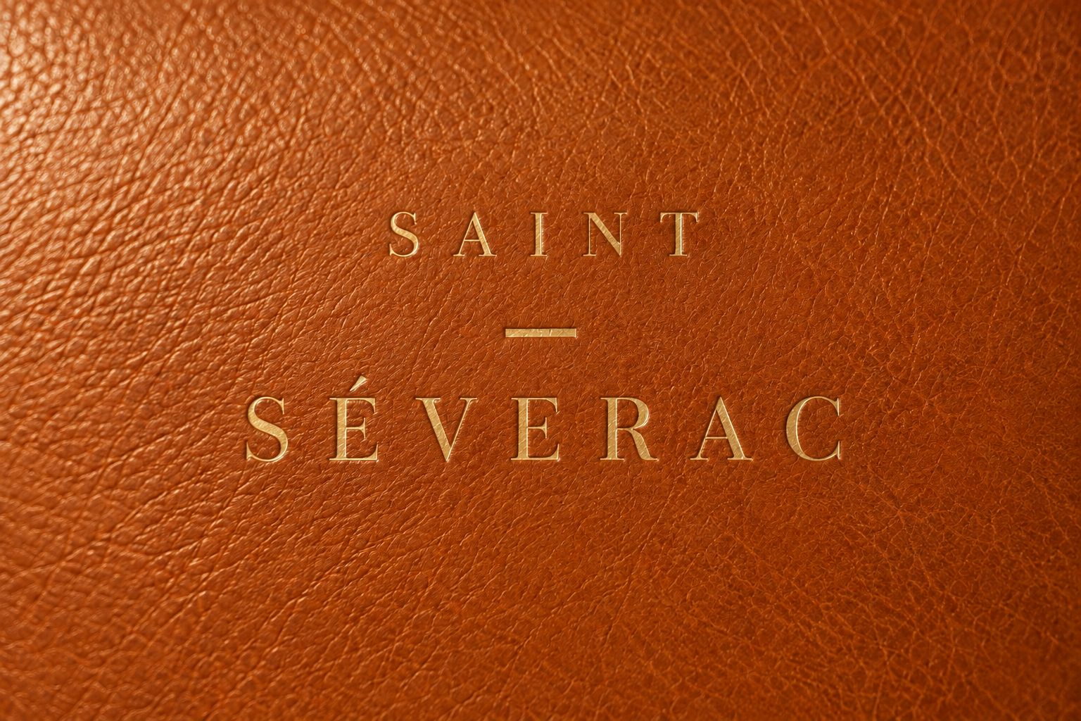
The wordmark pressed in gold into tan leather.
Colourways
Four grounds, one wordmark.
Use the lighter gold on dark and mid-tone grounds, and the deeper gold on cream. Gold on tan is a foil effect for large sizes only; on screen and at small sizes, use ivory.
Gold on deep dark
#C9A45C on #2A1B17. The primary version.
Gold on cream
#9A7424 on #F6F0E6. The deeper gold keeps its edge on light grounds.
On tan
#C9A45C on #B8601F. A leather foil, large sizes only.
On bordeaux
#C9A45C on #561B24. Rich and calm.
Clear space
Room to breathe.
Keep a margin on every side equal to x, the height of the capital letters in SÉVERAC. Nothing else enters that space: no text, no edges of the page, no pattern.
Minimum size
Small, but never faint.
Below 140 px wide on screen, or 28 mm in print, the thin gold letters start to disappear. Switch to the small cut: the same three lines, set heavier and in a darker colour, never in gold. Do not go below 110 px, or 22 mm.
Full wordmark, smallest
140 px wide on screen, 28 mm in print.
Small cut on cream
Heavier weight, espresso #2A1B17. 110 px, 22 mm.
Small cut on tan
Heavier weight, ivory #F6F0E6. 110 px, 22 mm.
Using it well
Six small rules.
Always three lines, always centred.
Never drop the accent: it is SÉVERAC, never SEVERAC.
Gold on dark, deeper gold on cream. Gold on tan only at large sizes.
No shadows, outlines, gradients or other effects.
Small text is set heavier and darker, never in gold.
Keep the clear space free of every other element.
Next
Colour and type →