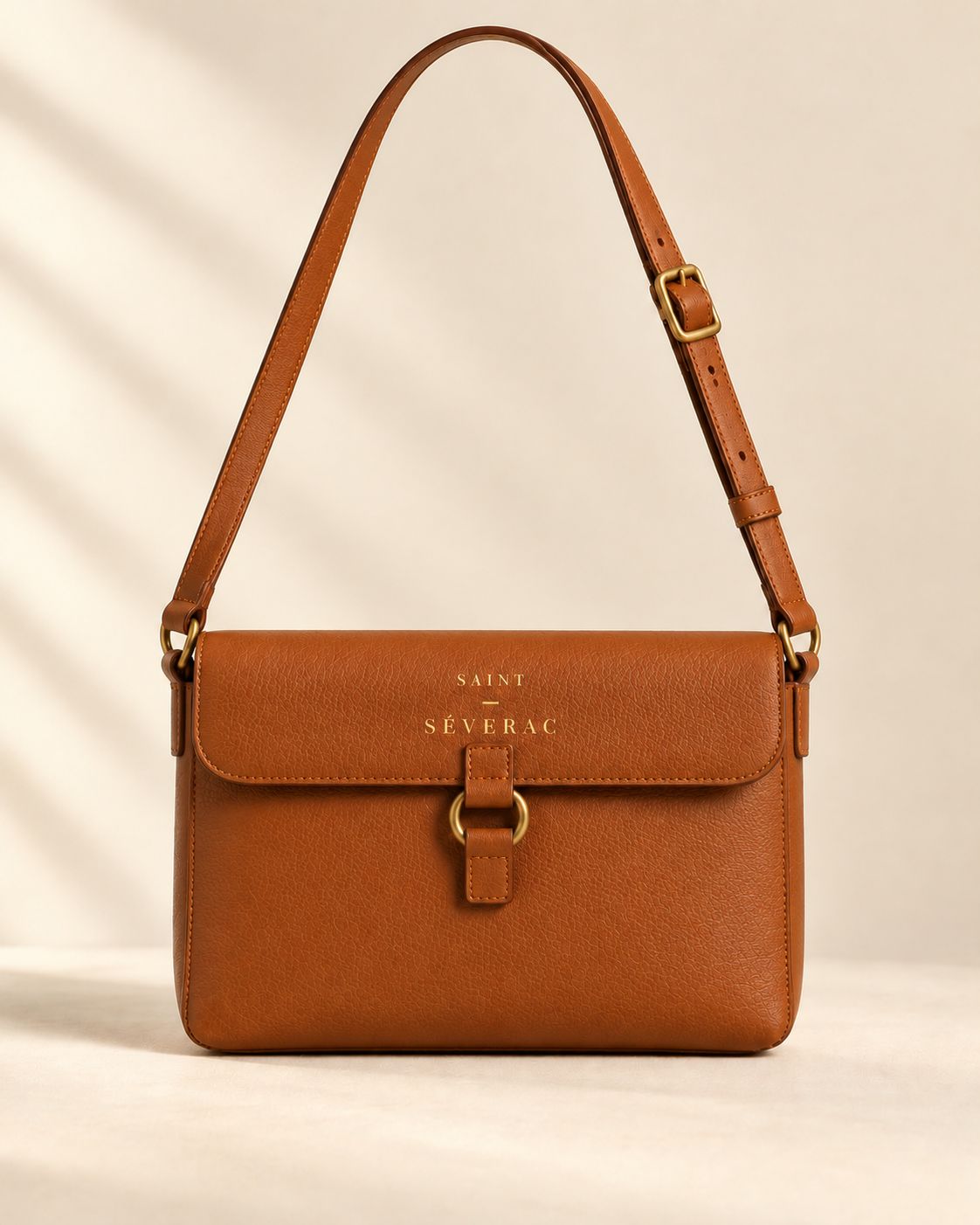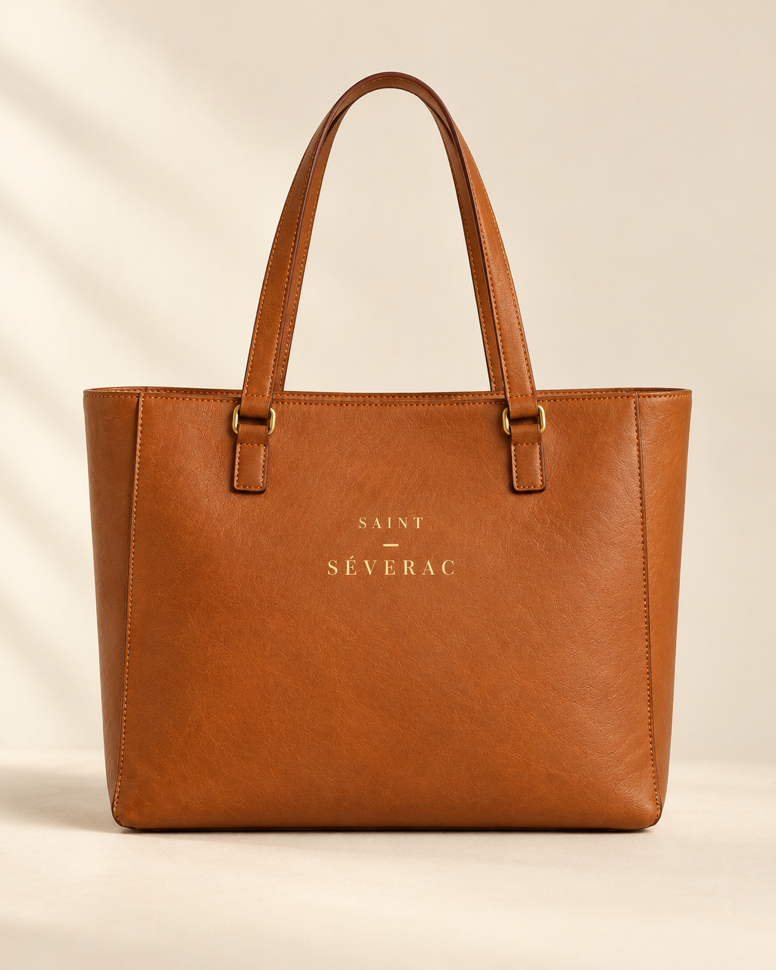
The work tote
$295
Design kit · 02 Components
Each component is shown as it rests, and as it looks on hover, with the keyboard focus ring, when pressed, and when it cannot be used. Where a state does not exist, the page says so and why.
ann · colour-bordeaux · colour-ivory
One calm line above the header. Ivory on bordeaux. The wording is a placeholder: delivery terms are to be confirmed. It must never show a countdown, a deadline or urgency.
Delivery details to be confirmed.
Delivery details to be confirmed.
Phone: still one line.
Not applicable. It is a plain line of text with no link and no close button. It never changes, counts down or rotates.
pcard · ratio 4:5 · font-heading 24 · font-label
Image, name, colour name, price. The name is the link. The picture is square-cornered and 4 : 5. No ratings, no badges, no "new" or "bestseller".
Default
$295
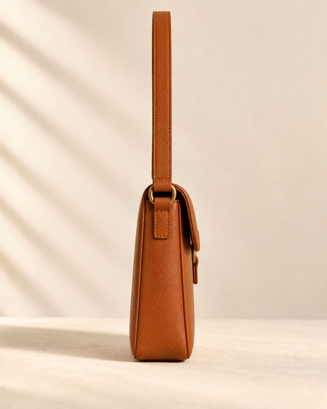
Hover: side view
$295
Focus
$295
Active (pressed)
$295
Disabled
Not applicable. A product that cannot be bought is simply not shown. There is no sold-out card and no "only a few left".
Live with colour choice
$195
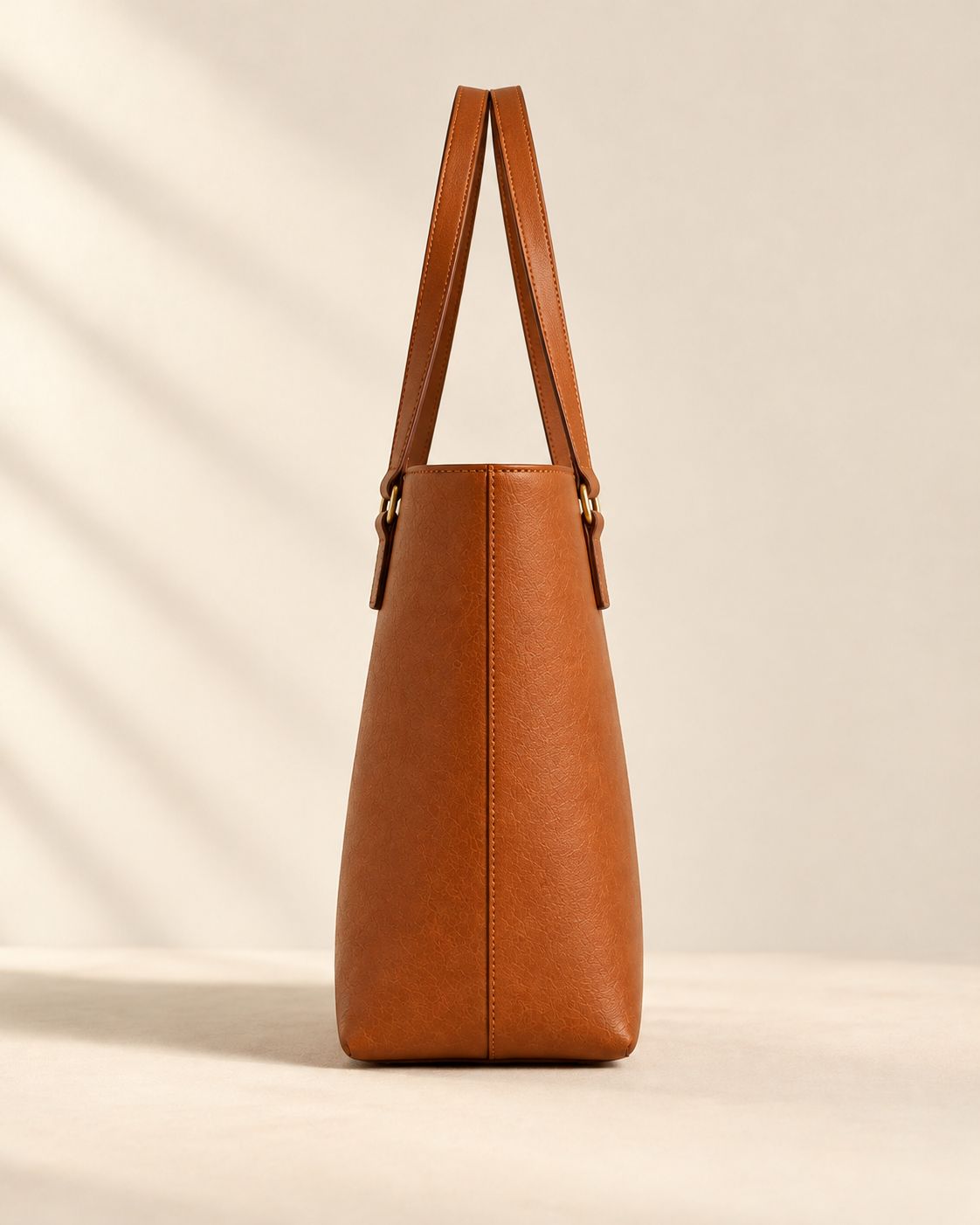
Hover or focus the card: the front image fades to the side image in 500 ms and eases in by 3%. With reduced motion, the side view simply appears. On a phone, with no hover, only the front shows. Choose a swatch and the card changes colour.
sw · colour-tan · colour-bordeaux
Two round swatches: Tan and Bordeaux. Each shape is one product with a colour choice.
Default (Tan chosen)
Bordeaux chosen
Hover
Focus
Active
Disabled
Round, 26 px, in a 44 px tap area. The chosen one has a thin ring and the colour is also written out: "Colour: Tan", so colour alone never carries the meaning. The product image changes with the choice: try it on the live product card above and in the Shop patterns page.
qty · radius-2 · 44 px targets
Minus, number, plus. It never goes below 1 and stops at 9. There is no stock message and no limit warning.
Default
Hover (minus)
Focus (minus)
Active (plus)
At the minimum
Disabled
Every default one is live: press the buttons.
acc · font-label · line-gold
Details, Care and Delivery on the product page. A plus that turns to a minus when open. Only true, plain statements.
Full-grain, genuine leather, handcrafted in France. A brass ring joins each handle to a stitched leather tab. The lining is the other colour: bordeaux inside the Tan bag, tan inside the Bordeaux bag.
Wipe gently with a soft, dry cloth. Keep away from direct heat. Store upright in a cool, dry place.
Delivery details to be confirmed.
Live: open and close each section. Built on the browser's own details element, so it works with the keyboard and a screen reader.
Default (closed)
Wipe gently with a soft, dry cloth.
Hover
Wipe gently with a soft, dry cloth.
Focus
Wipe gently with a soft, dry cloth.
Active
Wipe gently with a soft, dry cloth.
Open
Wipe gently with a soft, dry cloth.
Disabled
Not applicable. A section is always available.
crumb · colour-espresso-soft · font-label
Where she is: Home, Collection, then the product. The last step is plain text, not a link.
Default
Link hover
Link focus
Link active
Disabled
Not applicable. Every step is a real page.
f-input · f-select · f-check · radius-2
Labels always sit above the field and are never replaced by placeholder text. Messages are written the way she is spoken to: plain and kind.
Email sign-up (live: try an empty or invalid address, then a valid one)
Error
Success
Text input
Default + helper
As you would like us to say it.
Hover
As you would like us to say it.
Focus / active
As you would like us to say it.
Disabled
Error
Please tell us your name, or leave this blank.
Success
Thank you.
Select
Default
Hover
Focus / active
Disabled
Error
Please choose a shape.
Checkbox
Default
Checked
Hover
Focus
Disabled
Error
Radio
Default
Selected
Hover
Focus
Disabled
Error
There is no red or green in the palette, so error and success are told apart by an icon, the words, and a heavier bordeaux border for an error. Field borders are soft espresso (7.4 : 1 on ivory), so the edge of every field is easy to see. Helper text sits under the field, never inside it.
scard · jcard · qcard · ratio 3:2 · radius-0
Three ways to tell a story: an image with words, a journal entry, and one quiet sentence.
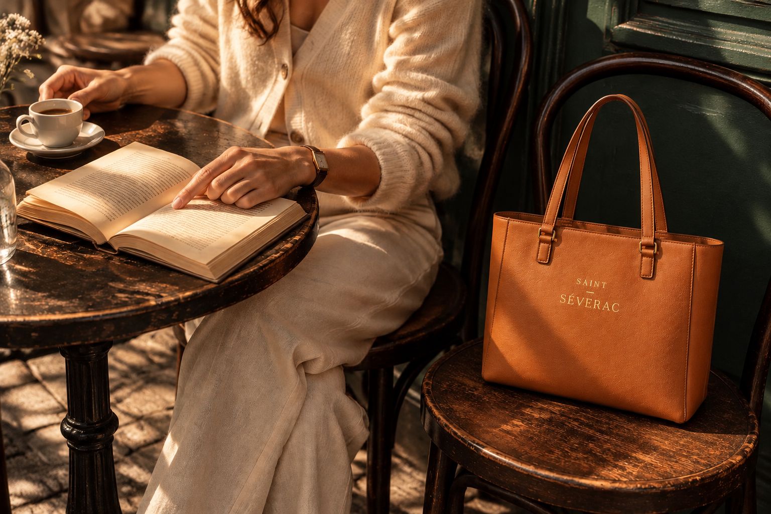
A quiet hour
The tan work tote, set down on the chair beside her while the afternoon slows.
Read the story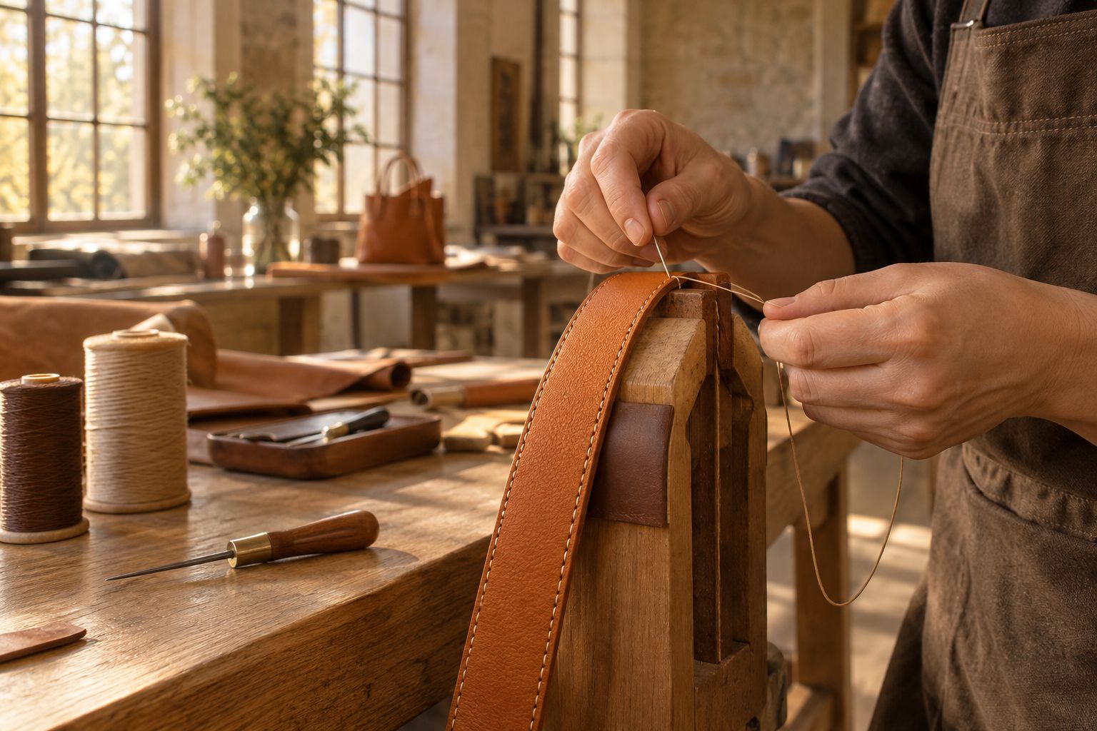
Journal · Craft
Each handle is held in a wooden clamp and stitched by hand.
Read moreFor all that she is.
Saint Séverac
Hover (the picture eases in by 4% over 600 ms)
A quiet hour
The tan work tote, set down on the chair beside her while the afternoon slows.
Read the storyJournal · Craft
Each handle is held in a wooden clamp and stitched by hand.
Read moreNot applicable. A quote card is not a link.
The quote card only ever carries the house voice, signed "Saint Séverac". It is never used for a customer review or a press quote: none exist, and none may be invented.