Design kit · 01 Foundations
The building blocks, taken from the leather.
Colour, type, space, shape and image rules for the website, the shop and the emails. Every value comes from the approved brand kit. Where this kit adds a detail the brand kit does not give, it says so.
Colour tokens
Eight tokens. Two of them are for lines, not words.
Tan
#B8601F
colour-tan
var(--colour-tan)
Warm accent. Large type (24 px and up), fine fills and the bags themselves.
Never small text
Bordeaux
#561B24
colour-bordeaux
var(--colour-bordeaux)
The deep colour. Primary buttons, bands, grounds, and headlines on light pages.
Cream
#EBE1D5
colour-cream
var(--colour-cream)
The calm base. Cards, quiet panels and the stone behind the bags.
Ivory
#F6F0E6
colour-ivory
var(--colour-ivory)
The lighter base. The page itself.
Espresso
#2A1B17
colour-espresso
var(--colour-espresso)
All text, and the deep dark ground (footer, email footer).
Soft espresso
#5C4A43
colour-espresso-soft
var(--colour-espresso-soft)
Secondary text, captions, and the border of every form field.
Gold on dark
#C9A45C
colour-gold-on-dark
var(--colour-gold-on-dark)
Wordmark and fine lines, on espresso and bordeaux only.
Never small text
Gold on cream
#9A7424
colour-gold-on-cream
var(--colour-gold-on-cream)
Wordmark, fine lines and link underlines, on cream and ivory only.
Never small text
Allowed pairs
What may sit on what.
Contrast ratios are calculated from the hex values. Reading text needs 4.5 : 1. Large type (24 px and up) and lines need 3 : 1. Tan and both golds never carry small text, in any component.
Reading text
Any size. Every pair here is 4.5 : 1 or better.
Espresso on Ivory
#2A1B17 on #F6F0E6
14.61 : 1
Body text on the page.
Espresso on Cream
#2A1B17 on #EBE1D5
12.83 : 1
Body text in cards and panels.
Soft espresso on Ivory
#5C4A43 on #F6F0E6
7.36 : 1
Captions, helper text, breadcrumbs.
Soft espresso on Cream
#5C4A43 on #EBE1D5
6.46 : 1
Captions inside cards.
Bordeaux on Ivory
#561B24 on #F6F0E6
11.74 : 1
Headlines, links, outlined buttons.
Bordeaux on Cream
#561B24 on #EBE1D5
10.31 : 1
Quotes and headlines in cards.
Ivory on Bordeaux
#F6F0E6 on #561B24
11.74 : 1
Primary button, bands, announcement bar.
Cream on Bordeaux
#EBE1D5 on #561B24
10.31 : 1
Secondary text on bordeaux.
Ivory on Espresso
#F6F0E6 on #2A1B17
14.61 : 1
Footer and dark grounds.
Cream on Espresso
#EBE1D5 on #2A1B17
12.83 : 1
Secondary text on espresso.
Large type, lines and the wordmark
These pairs are between 3 : 1 and 4.5 : 1 (or are a logo). Fine for a big word, a hairline or the wordmark. Not for small text.
Tan on Ivory
#B8601F on #F6F0E6
3.92 : 1
One large word as an accent. 24 px and up, never in a paragraph.
Tan on Cream
#B8601F on #EBE1D5
3.44 : 1
The same, on cream.
Ivory on Tan
#F6F0E6 on #B8601F
3.92 : 1
The small wordmark cut on a tan ground (a logo, set at 110 px wide or more).
Gold on cream on Ivory
#9A7424 on #F6F0E6
3.78 : 1
Wordmark, hairlines and link underlines. Never words.
Gold on cream on Cream
#9A7424 on #EBE1D5
3.32 : 1
Wordmark, hairlines and link underlines. Never words.
Gold on dark on Espresso
#C9A45C on #2A1B17
7.06 : 1
Wordmark and hairlines. Never words, even though it passes.
Gold on dark on Bordeaux
#C9A45C on #561B24
5.67 : 1
Wordmark and hairlines. Never words, even though it passes.
Never used
Shown as two swatches on purpose, so nothing here can be copied by mistake.
Tan on Bordeaux
#B8601F on #561B24
3.00 : 1
Tan and bordeaux meet through cream, never directly.
Gold on dark on Cream
#C9A45C on #EBE1D5
1.82 : 1
Wrong gold for the ground: use gold on cream (#9A7424).
Soft espresso on Tan
#5C4A43 on #B8601F
1.88 : 1
Far too faint for any text.
Gold on dark on Tan
#C9A45C on #B8601F
1.89 : 1
A foil effect for the wordmark at large sizes only. Never text.
Type tokens
One serif to speak, one sans to explain.
font-heading
Aa
Cormorant Garamond Medium 500
Headings and the wordmark. Italic for a quiet emphasis. Fallback: Georgia, then any serif.
font-body
Aa
Jost Regular 400
Body text. Fallback: Arial, then any sans-serif.
font-label
Aa
Jost Medium 500
Small labels, captions, prices, buttons. Small text is always Medium, in espresso or soft espresso.
The full scale
Only the three largest steps get smaller on a phone. Everything else holds its size, as in the brand kit. The phone sizes for Display, Heading 1 and Heading 2 are the brand kit's smallest values; Lead at 18 px on a phone is this kit's suggestion.
Display
type-display
Cormorant Garamond Medium
Desktop 72 / 76 px
Phone 38 / 40 px
Hero headlines
Desktop
For all that she is.
Phone
For all that she is.
Heading 1
type-h1
Cormorant Garamond Medium
Desktop 56 / 60 px
Phone 32 / 36 px
Page titles
Desktop
A calm place to begin
Phone
A calm place to begin
Heading 2
type-h2
Cormorant Garamond Medium
Desktop 40 / 44 px
Phone 28 / 32 px
Section titles
Desktop
Made in France
Phone
Made in France
Heading 3
type-h3
Cormorant Garamond Medium
Desktop 28 / 32 px
Phone 28 / 32 px (holds)
Card and product names
Desktop
The everyday shoulder bag
Phone
The everyday shoulder bag
Lead
type-lead
Jost Regular
Desktop 20 / 32 px
Phone 18 / 28 px
Opening lines
Desktop
Made for the day, and for everything after it.
Phone
Made for the day, and for everything after it.
Body
type-body
Jost Regular
Desktop 17 / 28 px
Phone 17 / 28 px (holds)
Paragraphs
Desktop
A bag that carries her working day, and whatever else the day brings. Full-grain leather, handcrafted in France.
Phone
A bag that carries her working day, and whatever else the day brings. Full-grain leather, handcrafted in France.
Small
type-small
Jost Medium
Desktop 14 / 22 px
Phone 14 / 22 px (holds)
Captions, helper text, prices
Desktop
Genuine leather, in Tan and Bordeaux.
Phone
Genuine leather, in Tan and Bordeaux.
Label
type-label
Jost Medium, capitals, tracking +22%
Desktop 12 / 18 px
Phone 12 / 18 px (holds)
Eyebrows, buttons, tags
Desktop
Design kit · Concept pitch
Phone
Design kit · Concept pitch
Spacing scale
Nine steps. Nothing in between.
space-4
4 px
Hairline gaps, icon to text
space-8
8 px
Tight gaps inside a component
space-16
16 px
Default gap between related items
space-24
24 px
Grid gutter, card padding
space-32
32 px
Between a heading and its content
space-48
48 px
Between groups on a page
space-64
64 px
Between sections on a phone
space-96
96 px
Between sections on desktop
space-128
128 px
Largest breaks, hero and band padding
Page grid, widths and breakpoints
Twelve columns to read across, four to hold in the hand.
Desktop and wide: 12 columns
Gutter 24 px (space-24). Side margin 72 px. Content stops growing at 1096 px, centred, so the wide 1600 layout adds margin and not width.
Tablet: 8 columns
Gutter 24 px. Side margin about 38 px (5% of the width). The brand kit gives no tablet grid, so 8 columns is a suggestion of this kit.
Phone: 4 columns
Gutter 16 px (space-16). Side margin 20 px.
390
Phone
The design width. Everything must work here first.
768
Tablet
The menu button replaces the links. Two product columns. Split layouts stack.
1280
Desktop
The full header, four product columns, split layouts.
1600
Wide
Same content width as desktop. Image bands may run full width.
Content widths
Reading column: 680 px at most (about 70 characters).
Page content: 1096 px at most, centred.
Image bands and heroes: full width, edge to edge.
Email: 600 px, fixed.
Section rhythm
Phone: 48 px above and below each section (space-48).
Tablet: 64 px (space-64).
Desktop and wide: 96 px (space-96). Hero and story bands may use 128 px.
Shape and depth
Square, flat and quiet. A thread of gold.
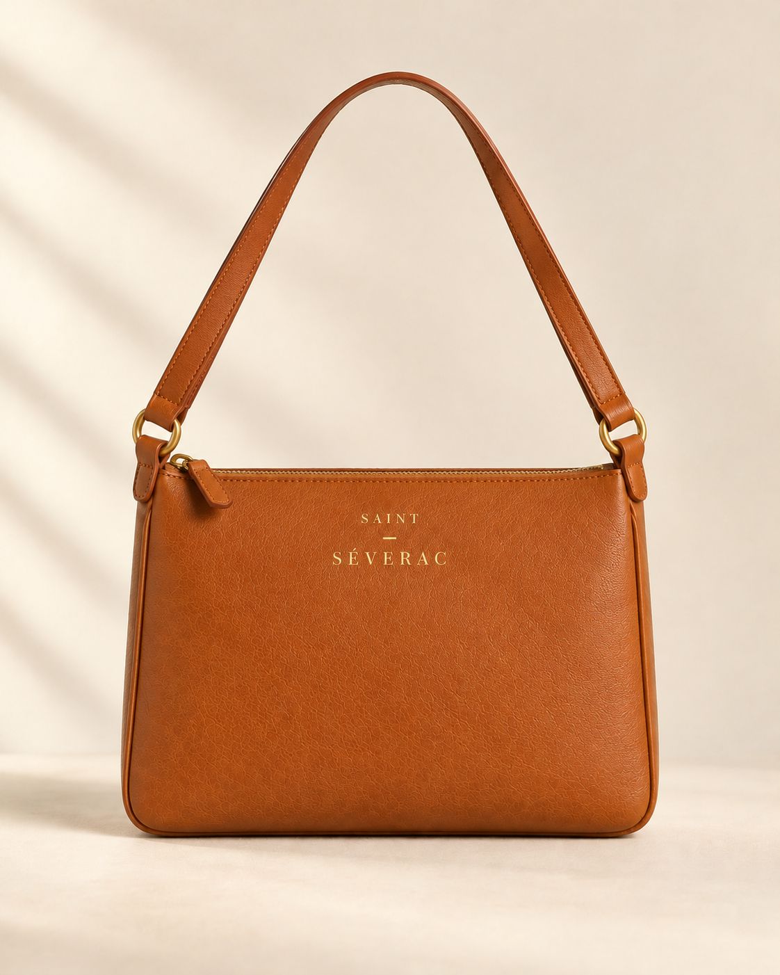
Images
radius-0
Square corners
A card
Square, with a 1 px gold hairline or none.
Cards
radius-0
Inputs
radius-2
Hairline
line-gold
1 px, #9A7424 at 55% on light grounds, #C9A45C at 60% on dark.
Always
Square corners on images and cards.
A 2 px radius on buttons and inputs, and nowhere else.
Fine 1 px gold hairlines to separate and to frame.
Depth from colour alone: ivory, cream, bordeaux, espresso.
Never
Drop shadows, glows or blurs.
Gradients, in any colour.
Rounded cards, pill buttons or rounded images.
Effects on the wordmark.
The one round thing: the colour swatches and radio buttons are circles, because a circle is how a colour chip and a radio button are understood. They carry no shadow and no gradient. Nothing else is round.
Image rules
Two shapes. Cropped, never stretched.
Keep the bag inside4 : 5 portrait
Every product image: front, side, back, interior and flat-lay. Source files are 1122 × 1402.
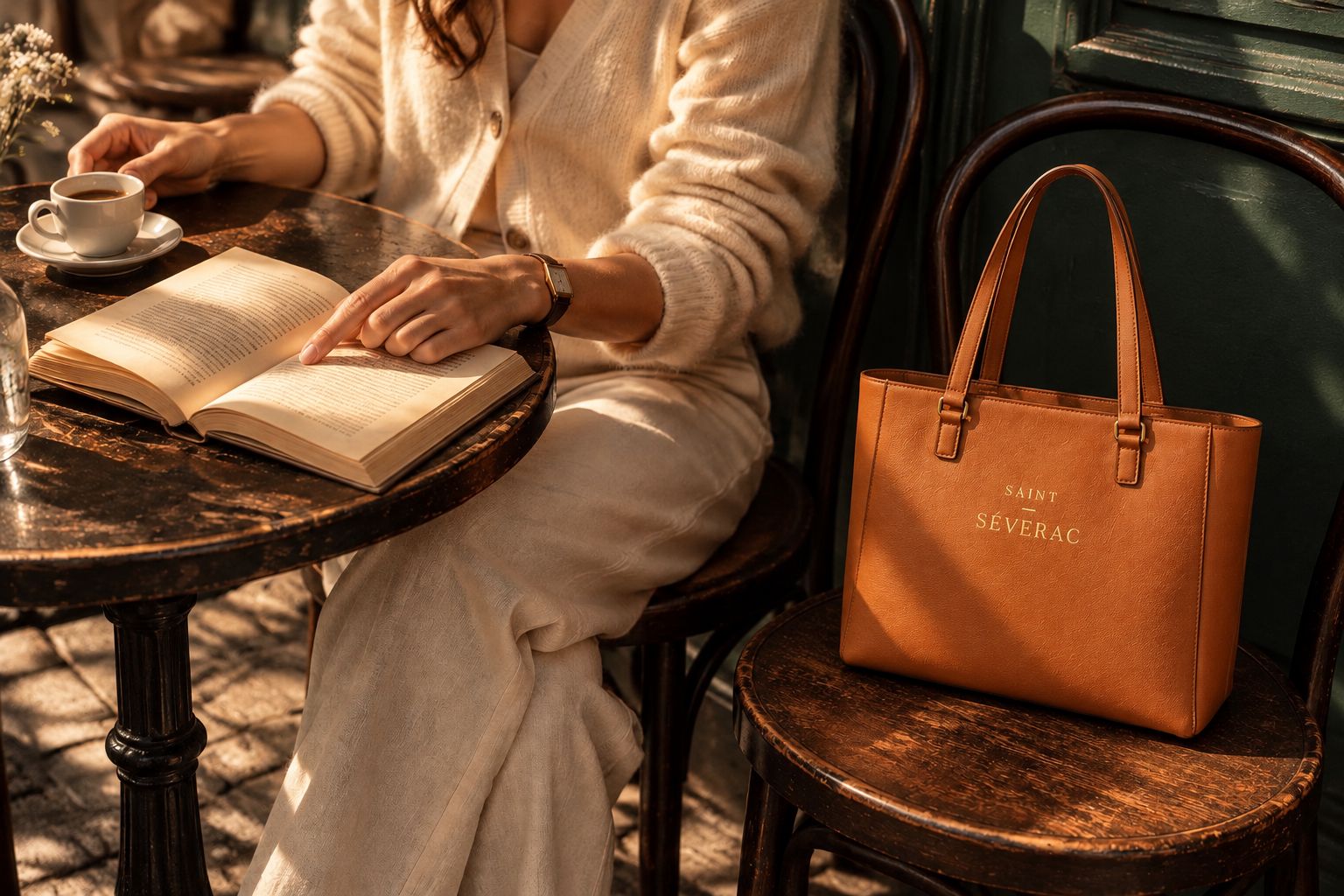 Safe area
3 : 2 scene
Lifestyle, making-of, pairs, heroes and bands. Source files are 1536 × 1024.
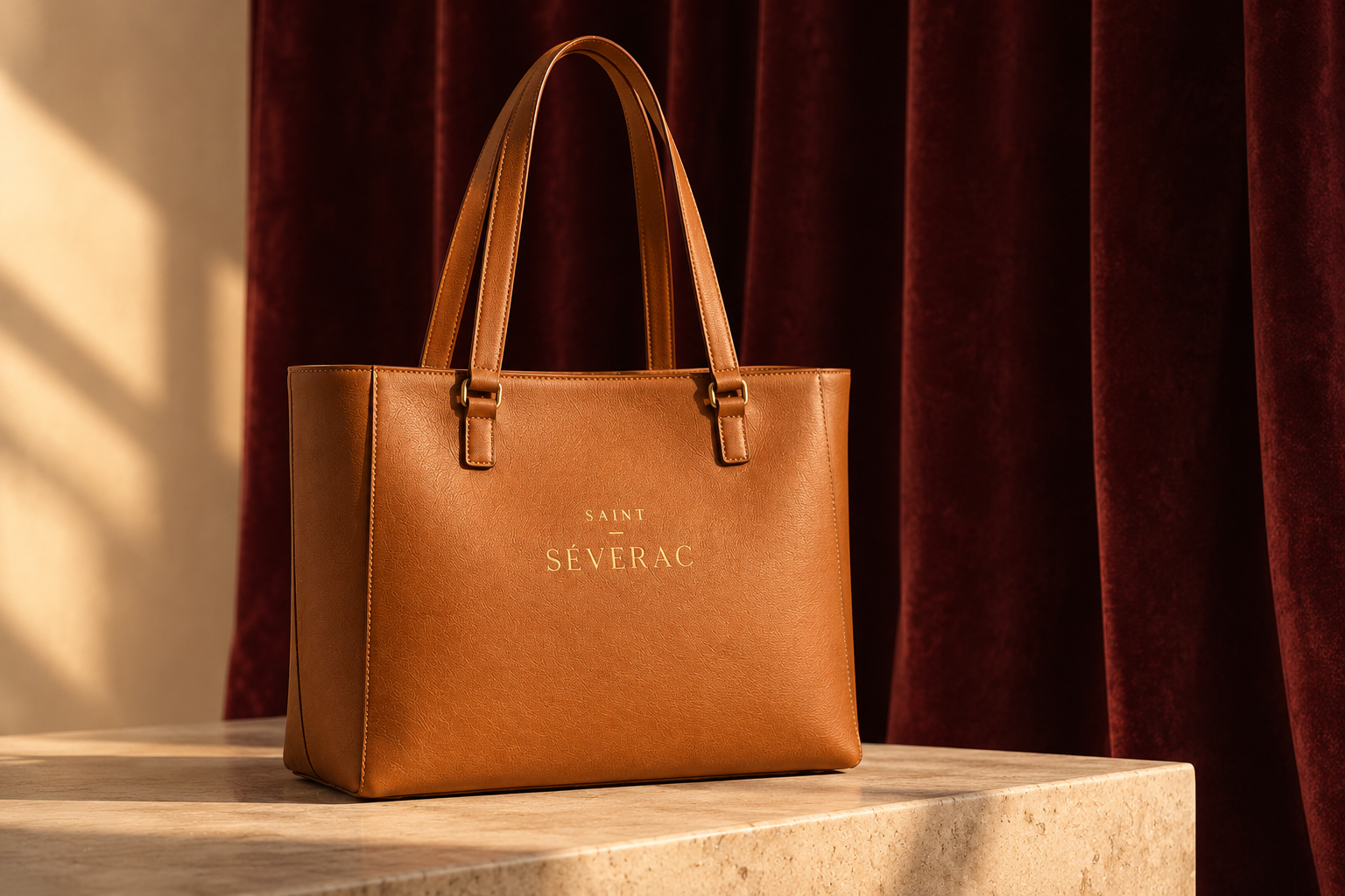
A band cropped from a 3 : 2 scene
Cropped with object-fit: cover and object-position: left center so the bag stays in frame.
How to crop
Set the shape with aspect-ratio (4 / 5 or 3 / 2) and let the width decide the height.
Fill the shape with object-fit: cover. Move the crop with object-position so the bag, never the empty space, stays inside.
Crop from the sides of a 3 : 2 scene, not the top. The bag sits at the bottom of most of them.
Never
Stretch or squash an image. A width and a height are never set together without object-fit.
Use a 4 : 5 image where a 3 : 2 is wanted, or the reverse, without cropping it properly.
Draw, generate, redraw or add effects to an image. Use only the approved files, as they are.
Put text over a product image. Text goes beside it, or over a scene with calm space (the home hero).